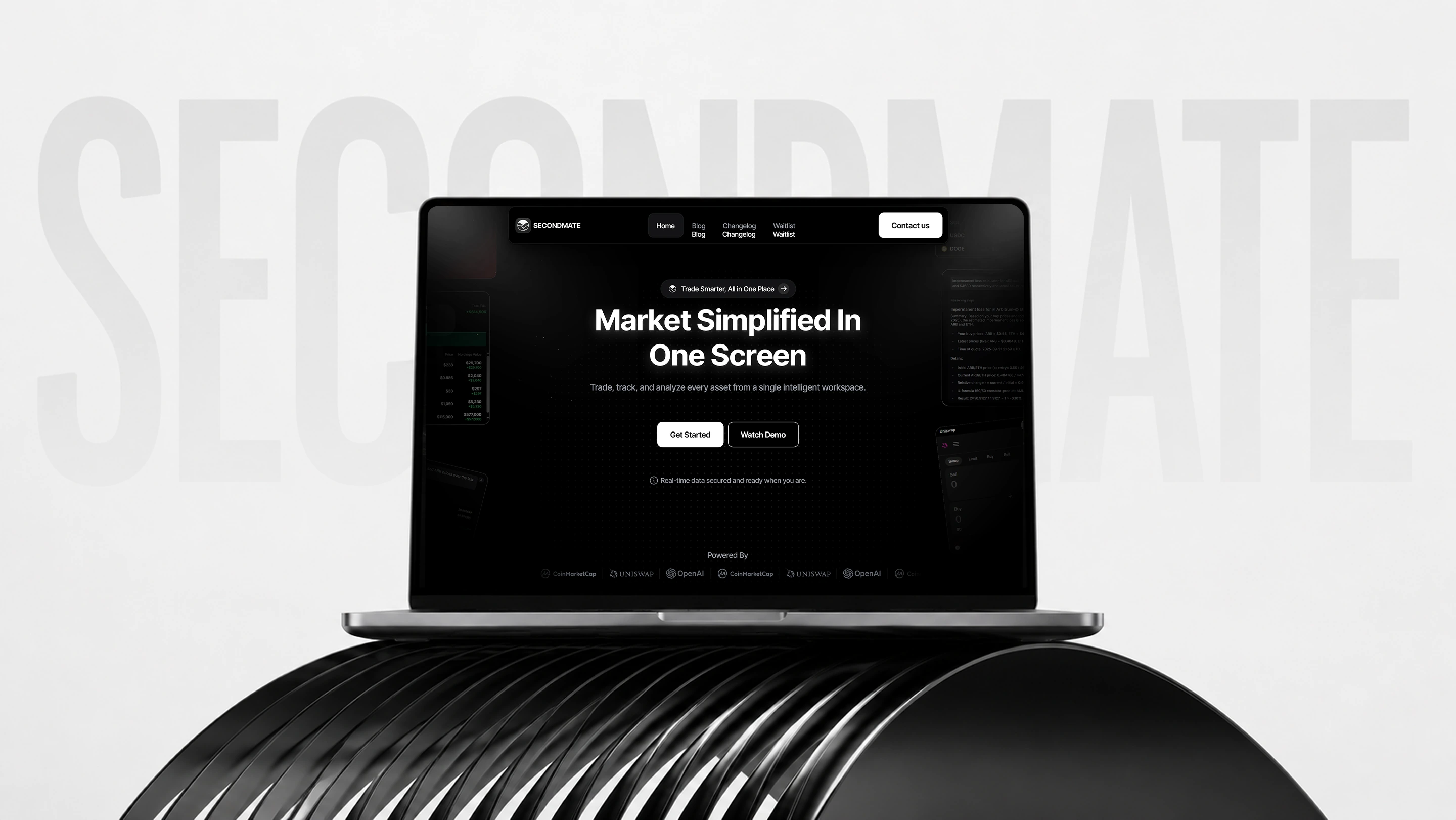
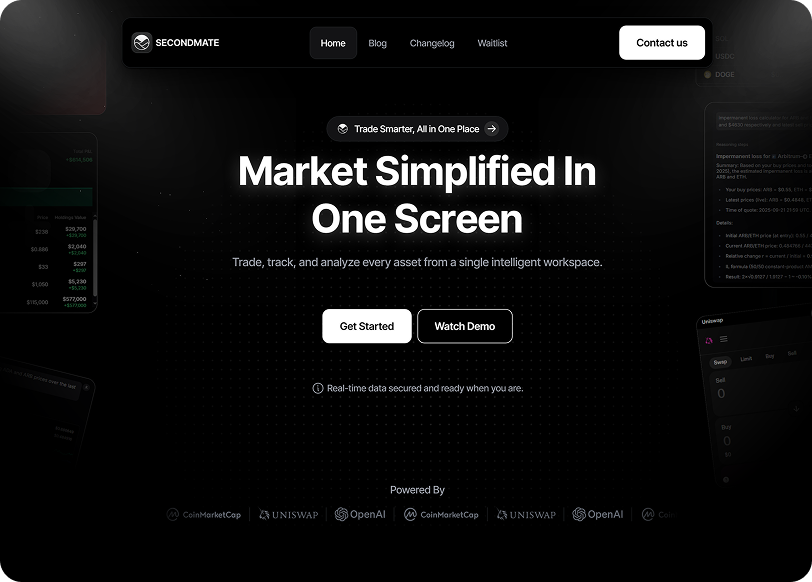
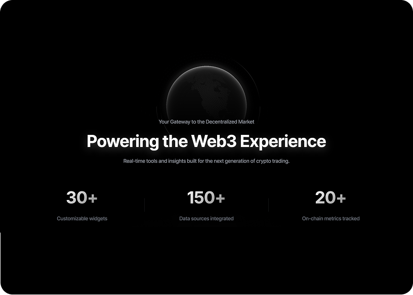
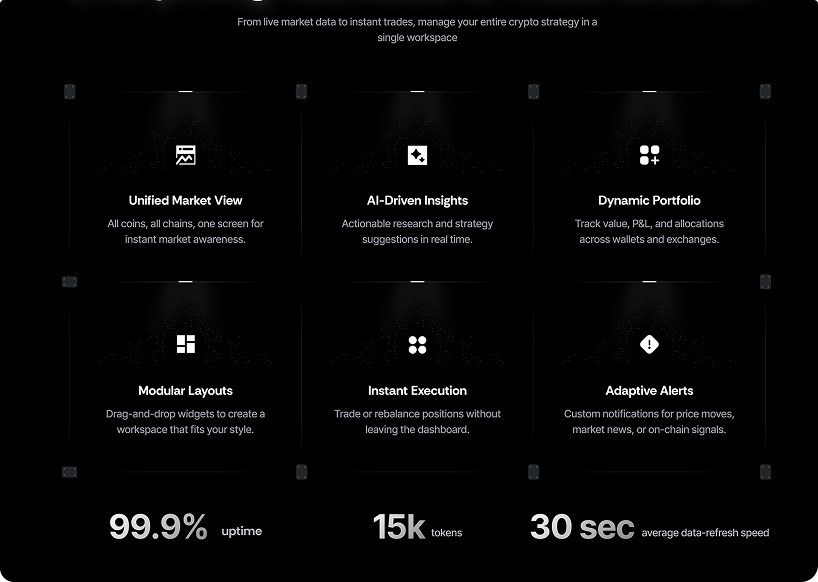
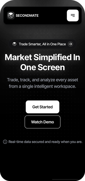
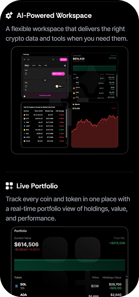
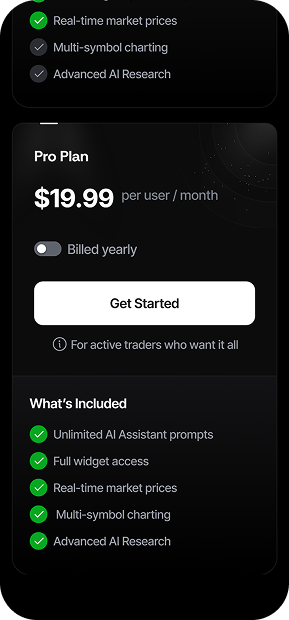
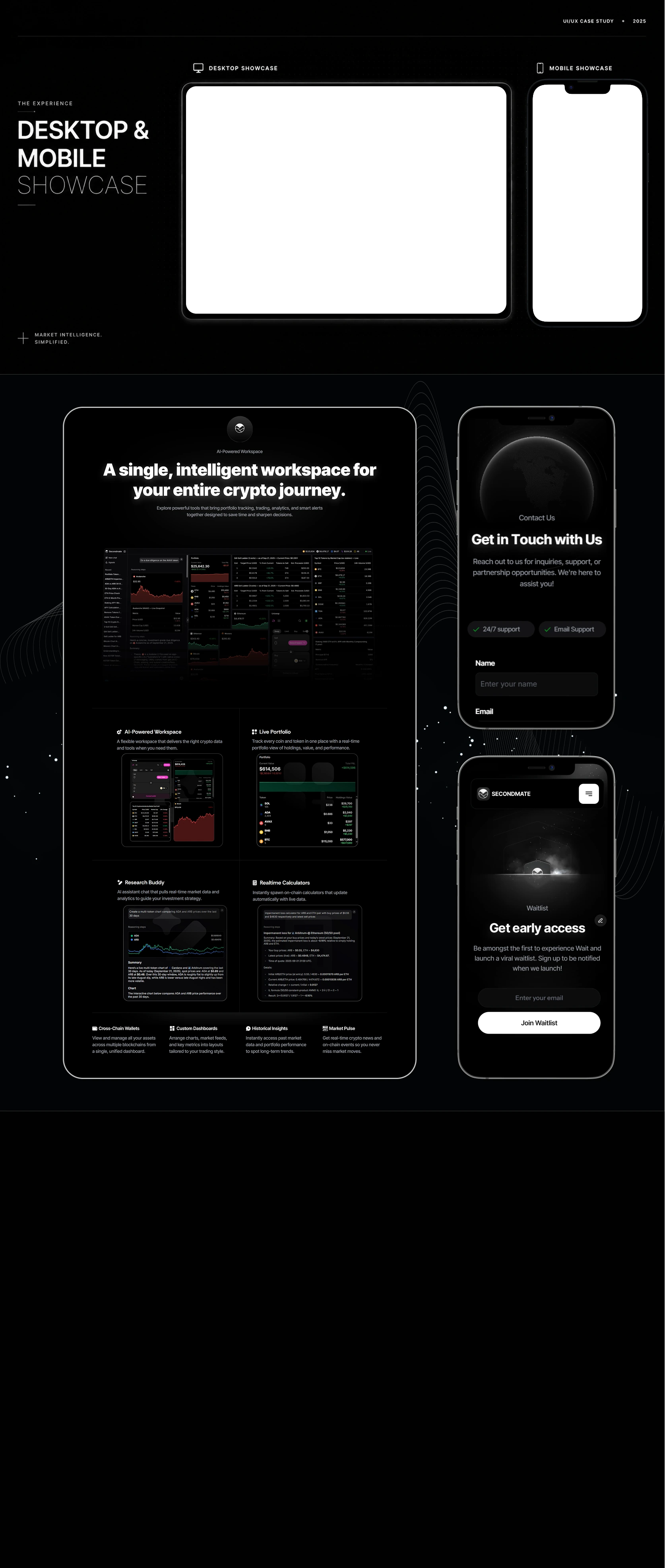
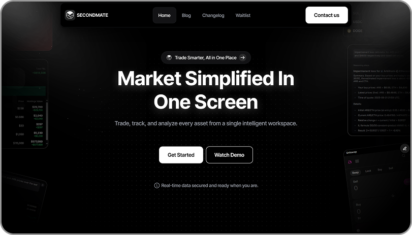
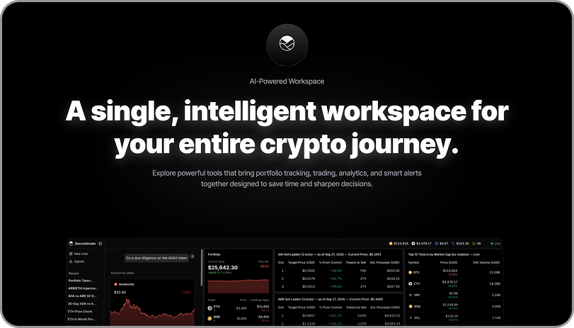
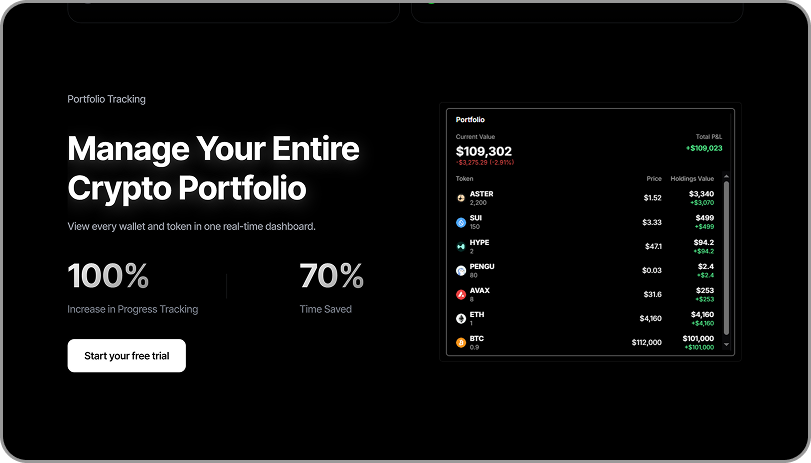
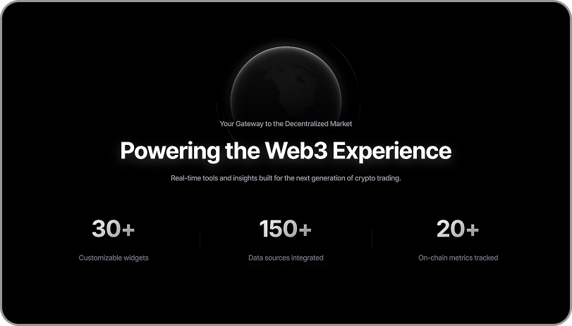
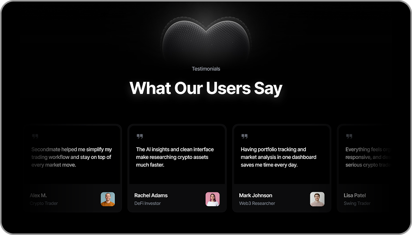
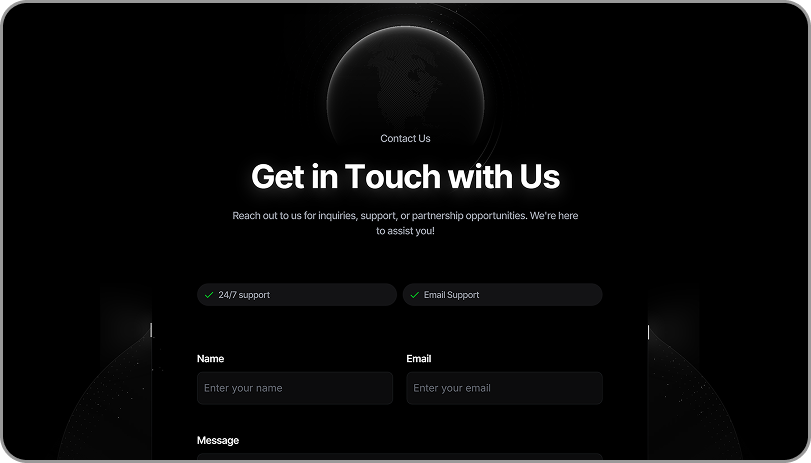
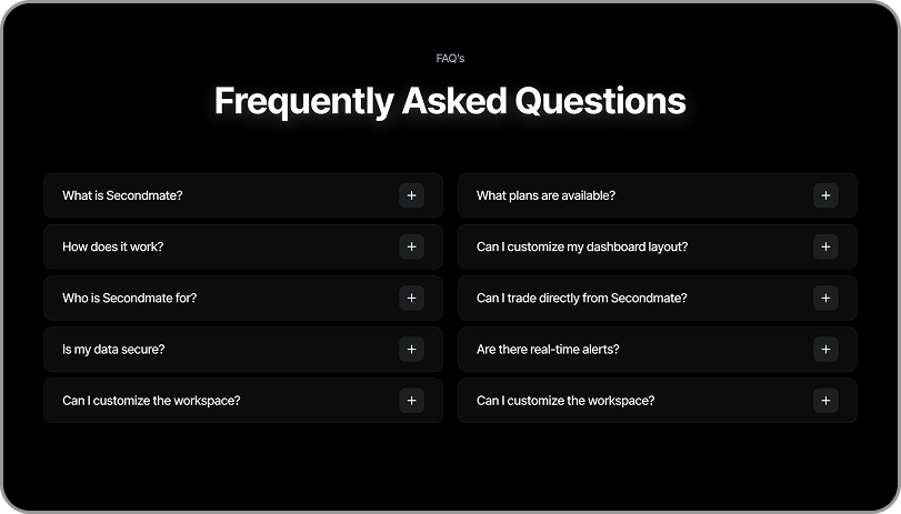
Website and UX for Secondmate, a crypto analytics platform. The workspace already existed. I designed the site that has to explain it.
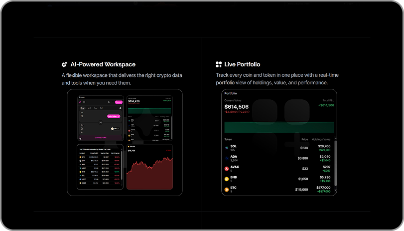
The Secondmate workspace is modular. A trader runs research, portfolio, sell ladders and charts as live panels at the same time. Traders pay for that amount of information. A first-time visitor can also find it too much and leave. Secondmate had no launch numbers to show, so the site could not simply claim it was credible. It had to show it.
I spent two weeks reading how traders talk about their tools on Discord and Reddit. I had seven conversations with active users, and I studied how three competing platforms introduce themselves. That showed three ways people decide on a tool, and it set the order of the page. The site answers questions in the order a doubtful visitor asks them. So most of the work was about order, not styling.
The whitelist passed 1,000 sign-ups. The beta reached more than 300 testers, along with creators. More than 20 partner conversations started after that. More than 80% of testers said the product matched what the site had shown them. That last number is the one I care about. The whole idea of the site was that showing the workspace works better than describing it.
- User research: watching Discord and Reddit, seven user conversations, three competitor reviews.
- Information architecture: a page order that answers questions one at a time.
- Wireframes through to interface for the hero and workspace sections.
- Design system: Inter Tight, a four-color monochrome palette, components.
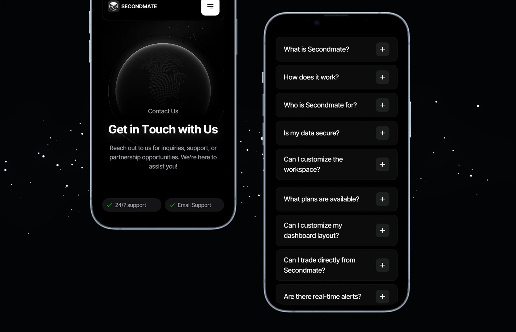
- Front-end build, desktop and mobile.