A marketing site for a crypto analytics platform. The product already existed. My job was to help a first-time visitor understand a complex technical workspace.
( UX & UI ) Research, IA & Design SystemMarketing site · Pre-launchSecondmate · 2025
( Overview )
A product I did not design
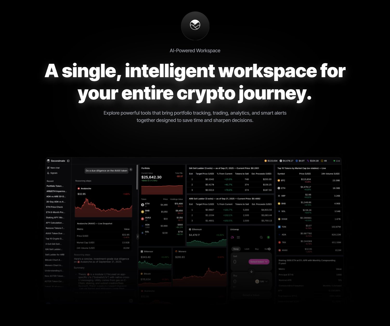
Secondmate is a crypto analytics platform. Traders use it to track markets, portfolios, and on-chain data from one workspace. The workspace runs as its own application.
That workspace already existed. I did not design it. I designed the website that has to explain it. The website has to help a first-time visitor understand a complex technical product, so they can decide whether to join the beta.
RoleUX/UI, IA, design system, front-end build
ScopeMarketing website, desktop and mobile
StagePre-launch, beta waitlist
ProductExisting analytics workspace, separate app
( The challenge )
Why the product was hard to explain
Crypto analytics tools compete on depth. The Secondmate workspace is modular. A trader can open as many live panels as they want at the same time, and arrange them however they like. Research, portfolio, sell ladders, token rankings, charts, swap and staking all run together. Traders pay for that amount of information. A first-time visitor can also find it too much and leave.
The site had to work for two kinds of visitor in the same page. An active trader wants to see the depth right away. If they do not, they think it is just another dashboard. A newer visitor needs to know what the product is before that depth appears.
There was a second problem. This audience often assumes a new platform is a scam until it proves otherwise. Secondmate had no launch numbers to point at. So the site could not simply claim it was credible. It had to show it.
Business goals
Explain a technical product without a sales call
Look credible with no launch numbers to show
Turn interest into beta waitlist sign-ups
Make the site as good as the product
User goals
Understand what Secondmate does on one page
Decide if it fits the way they already work
Look at the features before signing up
Decide whether the team is serious
( Research )
What I learned before designing
Crypto users ignore surveys and recruitment posts. So I went to the places where they already talk about their tools. For two weeks I read how traders discussed software in four Discord servers and several Reddit threads. I also had seven informal one-to-one conversations with active users. And I looked at how three competing platforms introduce themselves to a first-time visitor.
This is lightweight research, not a usability study. It showed three common ways people decide on a tool. Those three ways shaped the words, the navigation and the order of the page. The profiles below are composites built from repeated patterns. They are not real people.
Beginner investor
Composite profile · not a real person
Wants to understand exactly what a platform offers before creating an account.
About
Started investing in cryptocurrency recently. Researches a platform carefully before joining it, and wants simple, open products that explain what they do without technical jargon.
Goals
Understand what Secondmate offers
Compare features with competitors
Feel confident before signing up
Learn how the platform works
Needs
Clear product messaging
Transparent pricing
Trust signals
Simple onboarding
Pain Points
Overwhelming crypto terminology
Confusing landing pages
Too many features presented at once
Difficulty trusting new platforms
Active trader
Composite profile · not a real person
Moves on if the value is not clear in the first minute.
About
Trades on several exchanges and often tries new tools that could improve the way they work. Expects a website to say what it offers quickly, and to make features easy to compare.
Goals
Evaluate the platform efficiently
Discover unique features
Save time researching
Improve trading workflow
Needs
Fast navigation
Clear feature descriptions
Product screenshots
Performance-focused messaging
Pain Points
Generic marketing websites
Hidden information
Slow page performance
Vague product messaging
Founder & investor
Composite profile · not a real person
Reads a company’s website as a signal of how much attention they give the product itself.
About
Looks at SaaS and Web3 products, both to invest in them and to use them. Before trying a platform, checks how credible it looks, how it is branded, where the product is going, and how good the experience is.
Goals
Evaluate credibility
Understand the product vision
Assess long-term potential
Decide whether to join the beta
Needs
Strong branding
Clear value proposition
Security messaging
Professional presentation
Pain Points
Weak visual identity
Generic messaging
Missing trust indicators
Unclear positioning
( Competitive Review )
Three competing platforms
This is a design analysis, not a usability study. I looked at how three established platforms introduce themselves to a first-time visitor. I looked at what they show first, how they handle complexity, and when they ask the visitor to sign up. I chose these three because each one answers a different worry.
01
TradingView
Market analysis and charting
TradingView shows a live chart before it explains anything. You understand the value by using the chart, not by reading paragraphs.
The cost
The same features that prove the depth also confuse a new visitor after the first screen.
Takeaway
Someone judging an analytics tool needs to see it working. Start with real previews, not descriptions of them.
02
Glassnode
On-chain data and intelligence
Glassnode builds authority with depth. The research and the tone show that serious people work there. A visitor sees that as credibility before they reach a single feature.
The cost
Depth is hard to learn. A visitor who does not know what a metric means cannot tell if it matters to them.
Takeaway
Complex products should reveal detail in steps. Answer what it is and why it matters before showing advanced functions.
03
Nansen
Wallet intelligence and insight
Nansen sells the result instead of the data. It describes what you will find out, not how many rows you can search. That makes analytics feel like help with a decision.
The cost
It expects you to know the subject. A newer visitor may never understand why smart-money tracking matters to them.
Takeaway
People do not want more data. They want to feel sure about a decision. Talk about results before you talk about how it works.
What the review changed
1Value before features. The hero says what the product does in one plain sentence, before it names any feature.
2Fewer terms. The copy drops jargon a newcomer will not understand. No token names, no promises of alpha.
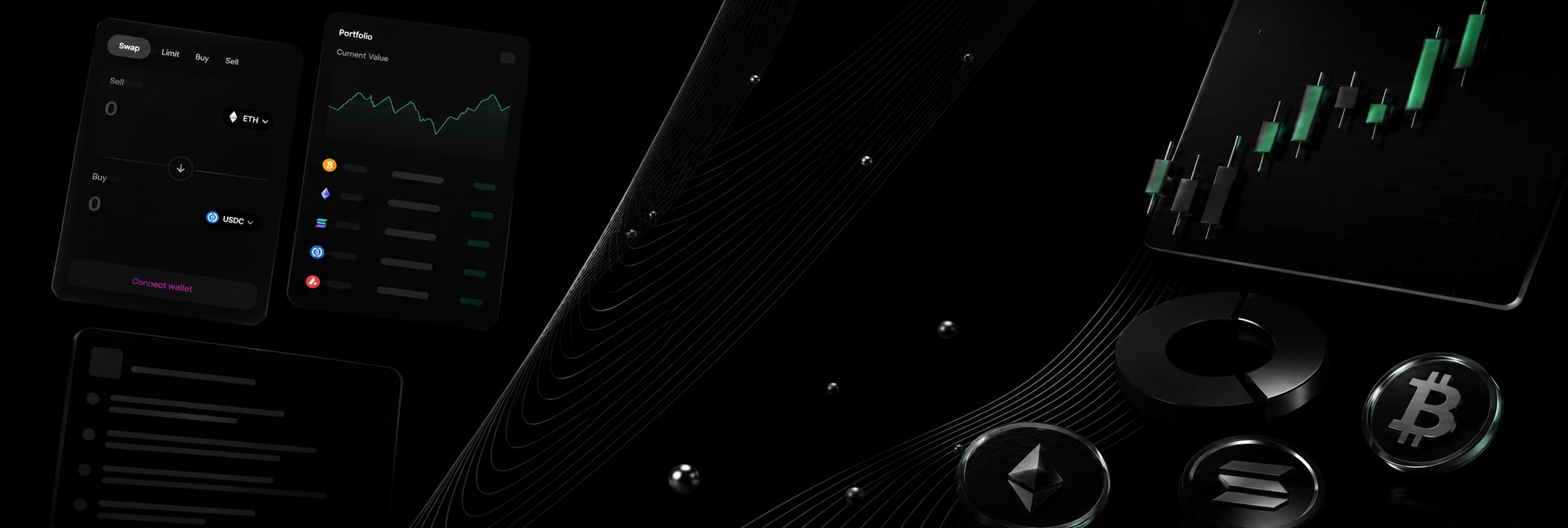
3Images do the explaining. Live portfolio, calculator and swap panels sit behind the headline, so you see the product before you read anything.
( Information Architecture )
The order of the page
The site answers questions in the order a doubtful visitor asks them. Each section answers one question before the next one starts.
What is it
The hero. One plain sentence over a picture of the live product.
Prove it
The whole workspace on one screen. No feature list instead of it.
What do I get
The features, grouped so they are easy to scan.
What does it cost
Pricing before we ask for anything, not after.
Why believe you
Facts about the product first: uptime, token coverage, refresh speed. Then what users say.
What if I’m unsure
The FAQ answers the questions that are left.
Now decide
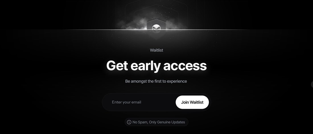
Trial and waitlist.
The navigation stayed flat: Home, Blog, Changelog, Waitlist, Contact. Changelog is there to build trust. A public changelog on a product before launch shows a careful audience that the team keeps working.
( Wireframe to interface )
From wireframe to interface
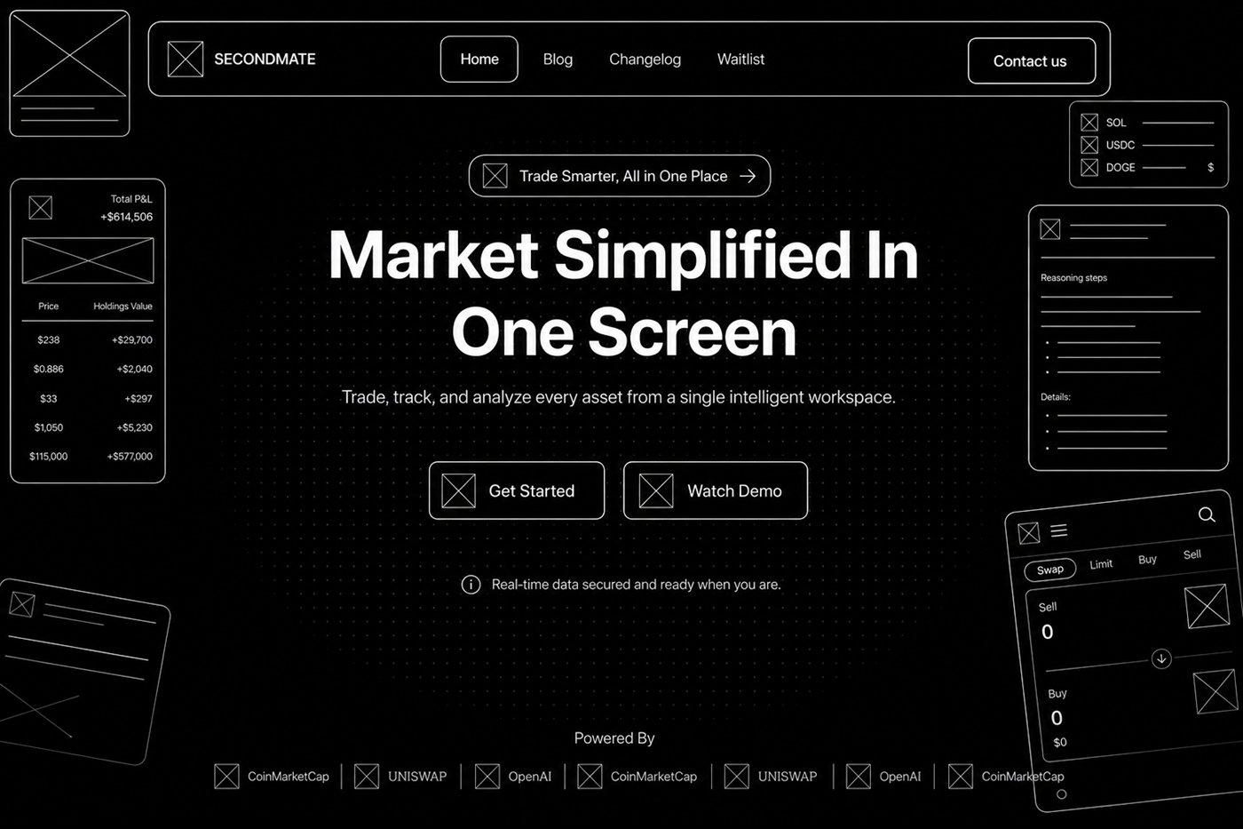
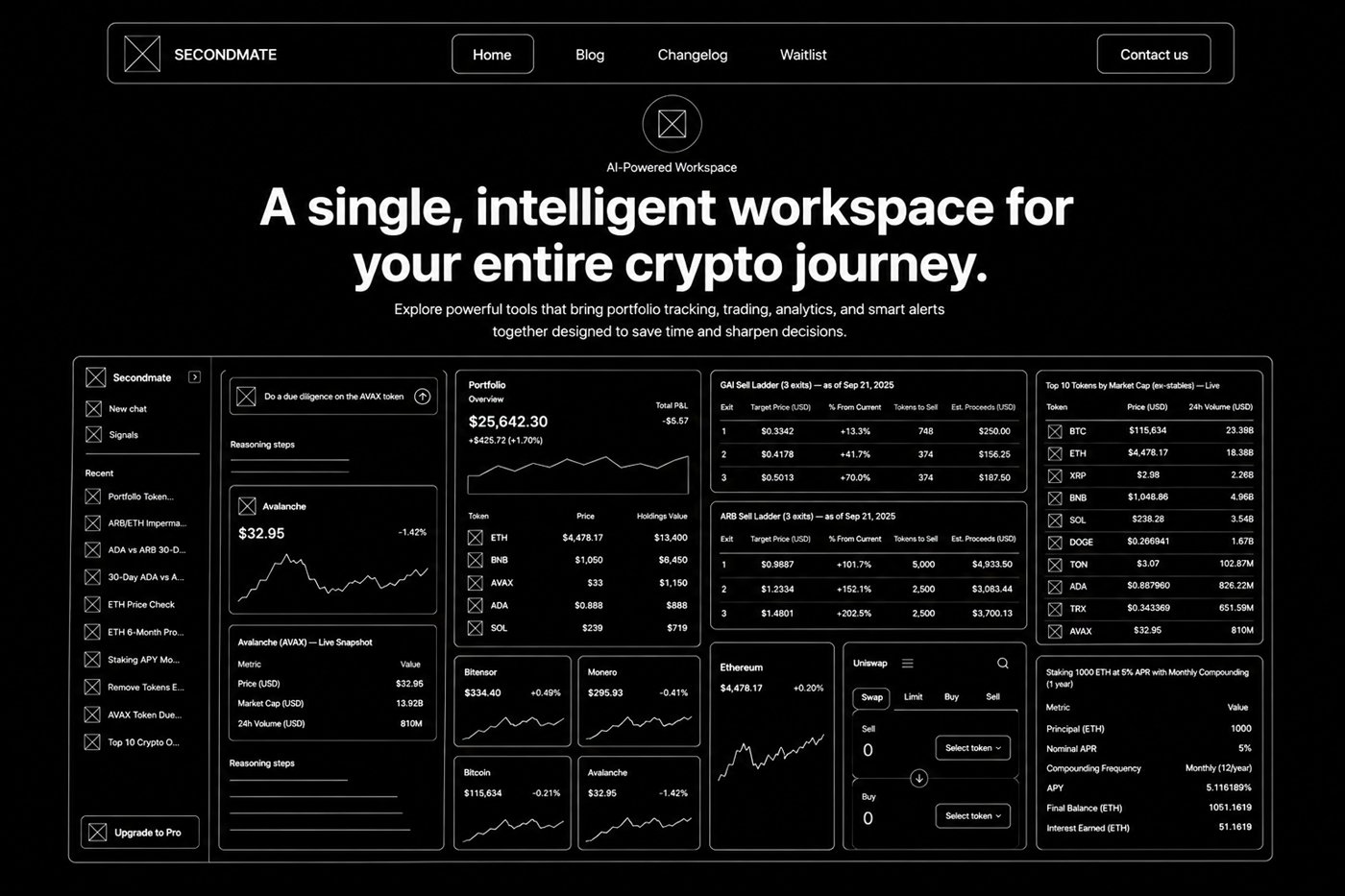
Every screen started as a low-fidelity wireframe. Each one asked the same question: can a lot of crypto information still be easy to read the first time you see it? The wireframes tested the reading order, not the styling.
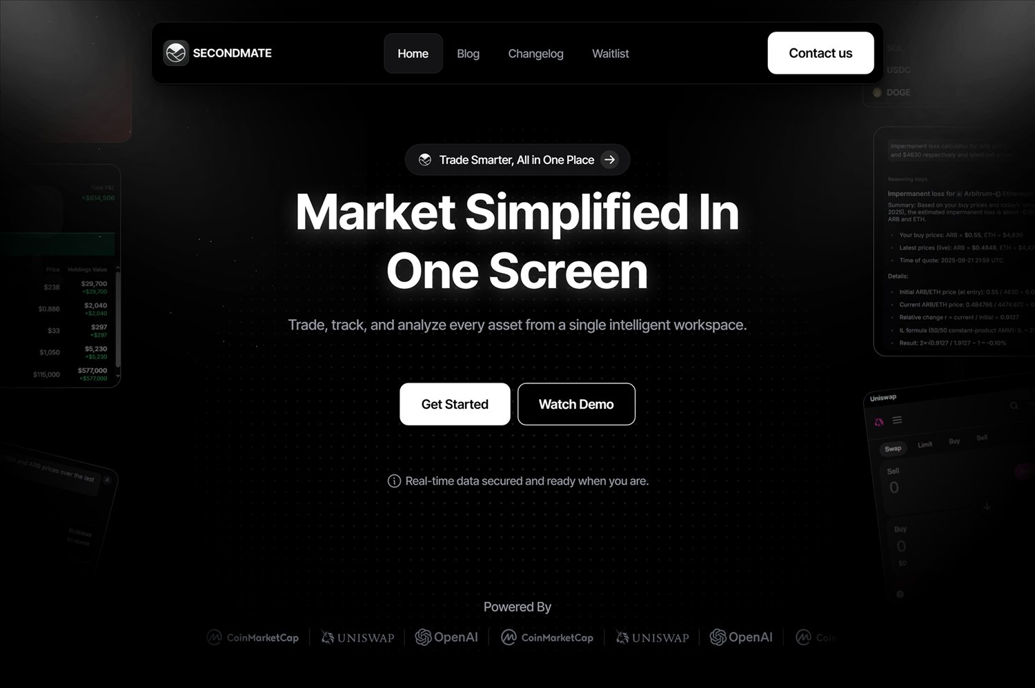
Two screens mattered most. The hero has to make a technical product understandable in seconds. The workspace section has to prove the product does what the hero says. Both kept their structure in the final build.
Low fidelity
Final interface
01 / HeroShow the product before the pitch
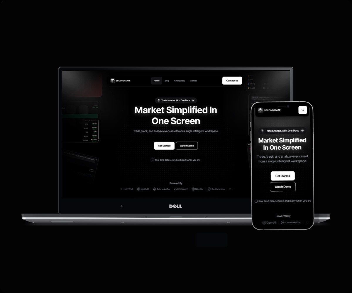
The wireframe set the order early: one claim, one supporting line, two buttons, and real market panels around the text. The build kept that order. The placeholder panels were replaced with the live interface.
1The two buttons — Get Started next to Watch Demo — stayed from wireframe to build. You can look first and sign up second.
2The placeholder panels became the real portfolio, calculator and swap interface. You see the product before any feature is named.
Low fidelity
Every module was placed and sized before any styling existed. The question was whether a screen full of live panels could still work, or whether it would just look like noise. If it did not work at this stage, styling it later would not fix it.
Final interface
02 / WorkspaceShow the whole workspace at once
The section does not list features. It shows the whole workspace at once. The wireframe placed every module — chat and signals rail, portfolio, sell ladders, token rankings, charts, swap, staking — to check that the screen was still readable before anything was styled.
1The module grid from the wireframe did not change: rail on the left, portfolio and holdings in the center, ladders and market data on the right.
2Every number in the wireframe was a placeholder. The build replaced them with live market data, and no module moved.
( Key Decisions )
Three decisions
The proof points shown in the concept panel below are illustrative content from the design exploration, not independently measured project results.
Each decision below answers one of the three ways of deciding that the research showed.
01
Show the product before the pitch
Challenge
Users could not judge the platform from marketing text alone.
Decision
The hero starts with realistic product mockups and interface previews, not abstract images.
Why it mattered
Seeing the product early made people less unsure. It also made the value of Secondmate easier to understand in the first few seconds.
02
Show fewer features at once
Why traders choose Secondmate
Everything you need to analyze, track, and improve your trading performance.
Real-time analytics
Track your performance in real-time with advanced dashboards.
Smart insights
AI-powered insights help you spot patterns and opportunities.
Risk management
Monitor risk, protect capital, and trade with confidence.
All in one place
Connect your accounts and manage everything in one clean interface.
Challenge
The early content showed too many features at once. The page felt heavy.
Decision
I grouped the features into a simpler order. The most important benefits come first. The details come later on the page.
Why it mattered
This made the page easier to scan. Visitors understand the main value before they reach the signup button.
03
Build trust before asking for signup
Built for traders. Backed by results.
30+Creators Tested
500+Early Projects
15+Builders Onboarded
96%Positive Feedback
“The AI insights and clean interface make researching crypto assets much faster.”
Rachel Adams
DeFi Investor
Challenge
Users did not want to act without enough proof that the platform was reliable and useful.
Decision
The page uses monochrome branding, regular spacing, images of the product, and copy about benefits before the final button.
Why it mattered
The page builds confidence first. It asks people to sign up only after they understand the value.
These decisions work together
The structure, the content and the visuals all do the same job. They reduce doubt, explain the value quickly, and lead people to the waitlist without pressure.
( Typography )
The typeface
A crypto dashboard puts a ticker next to a label next to a six-figure number. The type has to work at 72px in a headline and still be readable at 12px inside a data panel. Inter Tight does both. It was drawn for screens, and its narrow letters let a headline stay large without filling the screen.
The tight version matters. At large sizes, standard Inter looks loose, and loose looks like every other SaaS site. The narrower letters make headlines feel as compact as the product below them.
Aa
Inter Tight
Neo-grotesqueRegular - Bold72-16px scale
Type scale
72 / 48 / 32 / 24 / 18 / 16
In use
Everything in one place, clearly structured.
( Color )
Four colors and no accent
The product screen already has a lot of color. Charts are red and green, tokens use their own brand colors, and the swap panel is pink. Any accent color on the site would fight with the product it is there to sell. So the palette stays out of the way. The dashboard is the only colored thing on the page.
The second reason is the founder-investor profile. Crypto sites often use neon gradients to look energetic, and that is the look they have learned not to trust. A quieter site looks like a team that does not need to shout. The page gets its rhythm from levels instead of color: black for the page, carbon for surfaces, graphite lines to separate them.
There is one more benefit. Pure White on Absolute Black has a contrast ratio of 21:1, and the requirement is 4.5:1. So contrast was never a problem to fix later. Graphite is used for borders and dividers, never for text.
Absolute Black
#000000
Backgrounds and elevated surfaces - depth and focus.
Carbon
#121212
Surface color for cards, navigation, and UI.
Graphite
#2A2D32
Borders, dividers, and subtle UI elements.
Pure White
#FFFFFF
Primary text on dark and key highlights.
( Logo System )
The logo
The Secondmate logo has to stay readable everywhere it is used. It has a simple icon, fixed spacing, and rules for how to use it. Those rules keep the brand the same on the website and in future digital products.
Primary Logo
XXXX
1.25X
7.5X
Clearspace
The “X” unit sets the minimum space around the logo. No text, graphics or other elements should enter this area.
Logo on Dark
XXXX
Reverse Logo
Use the reversed logo on dark backgrounds. It keeps the logo visible and consistent.
Icon
XXXX
The symbol can be used on its own in small spaces, such as app icons, avatars and favicons.
Minimum Size
120px
32px
( Final Solution )
The finished page
The site opens with a plain sentence over a working product. A visitor sees the live portfolio, calculator and swap panels before they read a single feature name. Then they choose between watching a demo and starting. The workspace section answers the first question the hero raises. The rest of the page answers the other questions in the order a doubtful visitor asks them.
Facts about the product build the trust, in the place where traction numbers would normally go. The page explains a complex technical product without a sales call. It also looks like the team who built the dashboard built the site too.
( After launch )
The figures below are reported project figures, not independently verified analytics.
1,000+Whitelisted for the beta
300+Testers reached, with creators
20+Partners reached
80%+Found the app matched the site
The project materials reported more than a thousand whitelist sign-ups, more than three hundred testers, more than twenty partner conversations, and more than 80% positive feedback on the match between the product and the website.
That last number is the one I care about. The whole idea of the site was that showing the workspace works better than describing it. Testers found a product that matched what they expected. That is the closest thing I have to proof that the idea worked.
( Reflection )
What I would change first
In my competitive review I decided that Nansen wins because it sells results instead of data. I wrote that Secondmate should talk about results before it explains how the product works. The page I built does not fully do that. Unified Market View, Modular Layouts, Instant Execution and Adaptive Alerts are names of features, not decisions a trader makes. I applied the lesson in the hero, but not in the feature grid. That is the first thing I would rewrite.
Designing a site for a product I did not design taught me something new. I could not make the workspace simpler. I could only choose when a visitor sees it. So most of the work was about order, not styling.
Here is what I still do not know. The reported whitelist and tester feedback suggest that the site set the right expectations, but they do not show which part of the page did the work. I have no analytics, funnel data or live accessibility audit, so I cannot say whether the hero earns the sign-up or the workspace section does.