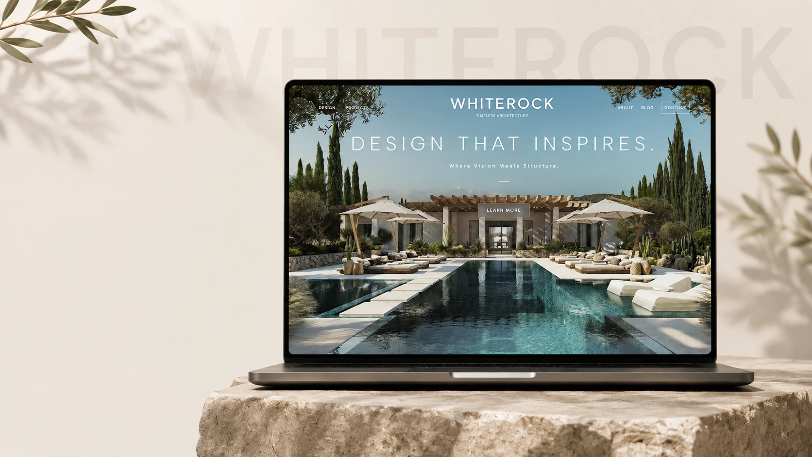
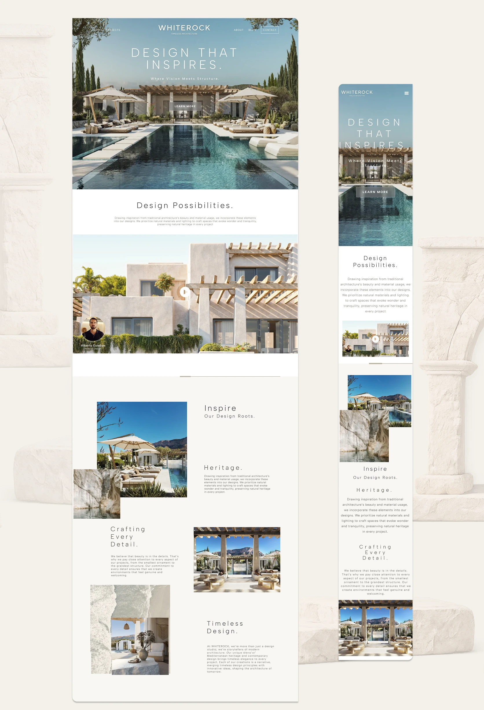
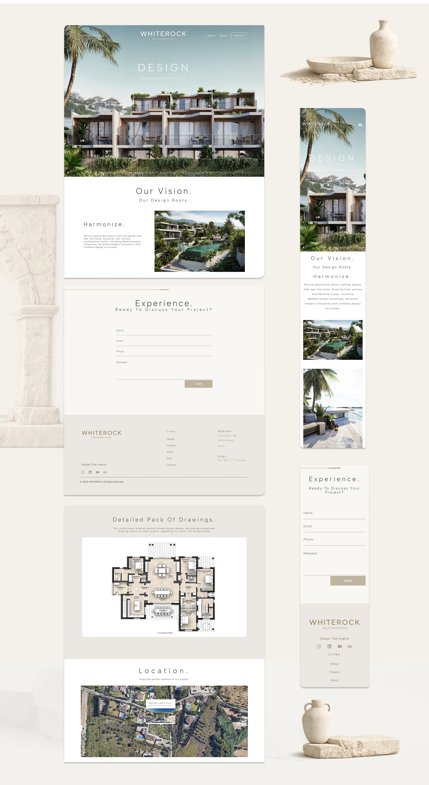
Content structure, responsive UI and front-end build for Whiterock, an architecture studio that works across several disciplines.
Whiterock works across several architectural disciplines, but its old site did not show that. It had polished renders and a crowded menu. Clients could not tell what the finished buildings were really like.
I designed a UX & UI system based on the architecture itself. Real photos lead every page. The navigation is five visible links with no sub-menus. The colors come from the studio’s existing brand material: stone, gold, charcoal.
After launch the studio reported more qualified enquiries. Several of them mentioned the new site directly. On the live build, Lighthouse returns 92 accessibility, 96 best practices, near-zero layout shift, and a 2.3s desktop load. I have no analytics, so I cannot tell you which part of the page did that.
- UX & UI strategy, research, and content structure.
- New navigation with five visible links: Design, Projects, About, Blog, Contact.
- A reusable component system with a set type and color scheme.
- Responsive layouts for desktop and mobile.