Let’s talk
Whiterock Mediterranean villa architecture
Back to project ( Case Study )

Behind
Whiterock

A responsive portfolio for a studio that does architecture, interiors, landscape, planning, and 3D. Clients can see all five without reading five service pages.

Studio portfolio · 2025 UX/UI & front-end Visit whiterock.studio ↗
( Studio and brief )

Five disciplines, one studio

Whiterock does architecture, interior design, landscape design, urban planning, and 3D visualization in one studio. It works on homes and on commercial buildings. The website had to show all of this without giving each discipline its own separate section.

I designed and built a responsive portfolio. The work comes first on every page. Each project shows which disciplines were involved. Clients can move from looking at projects to sending an enquiry.

RoleUX/UI Designer & Developer
TimelineTwo weeks
ScopeContent structure, responsive UI, front-end build
StatusCompleted responsive build · 2025
Design problem

Show everything the studio does, without turning the website into a list of services. Also show how each project was made, not only how it looks.

( Two-week process )

What I did in two weeks

The studio already had branding, project photos, and other material. My job was to turn that material into a content structure, a responsive interface, and a working front end.

01Week one

Find the structure

  • Review the existing website and the project material
  • Look at other studios that work across several disciplines
  • Read the audience notes from the previous website again
  • Plan the sitemap, the navigation, and the project-page order
  • Wireframe how visitors find work and send an enquiry

Outputs Content order, sitemap, navigation plan, and simple wireframes

02Week two

Build the experience

  • Set how type and images behave at each screen size
  • Design the desktop and mobile pages
  • Build reusable portfolio and content components
  • Build the responsive front end
  • Check navigation, forms, breakpoints, and image speed

Outputs Responsive UI, component system, working front end, and build testing

( Audience priorities )

Two kinds of client

Two groups of people use the site, and they make different decisions. Private clients want to know if the studio suits their taste and if they can trust it with their home. Development partners want to know if the studio has worked at their size, covers enough disciplines, and can explain a complex project well.

Evaluation path 01

Private commissions

Decision to make

Can this team turn my brief into a house that works?

What they assess
  • Homes that are close to what they want
  • Architecture, interiors, and landscape working together
  • How the studio works, from first idea to finished building
  • An easy way to get in touch
Portfolio response

Homes are grouped by project, not by discipline. Each one has a short text about the scope and the ideas behind the finished rooms.

Evaluation path 02

Development partnerships

Decision to make

Can this studio cover a large, complex development and deliver it?

What they assess
  • Experience with the same kind and size of building
  • Which disciplines worked on each project
  • Proof of the work, from first idea to 3D visuals
  • A direct way to send a project brief
Portfolio response

Project pages show the type, size, disciplines, and deliverables in a form that is quick to scan. The architecture still fills most of the page.
( Wireframe system )

How a project page is built

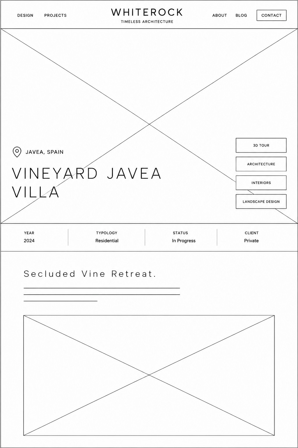
The wireframes set one pattern that every project page repeats. First name the project. Then show the main facts. Then explain the design idea. Then show the drawings and the location. Desktop and mobile use the same order, and neither turns the work into a plain photo gallery.

01 / Project entryThe project first, the facts close by

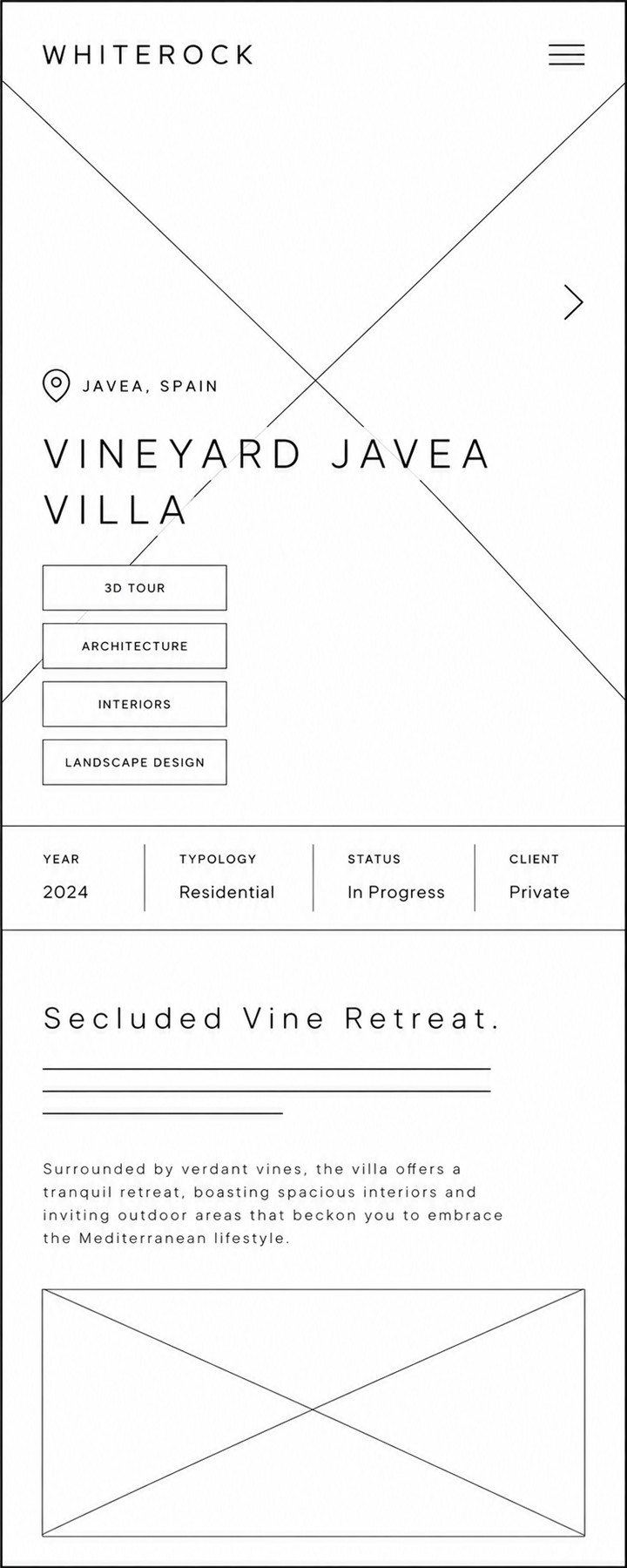
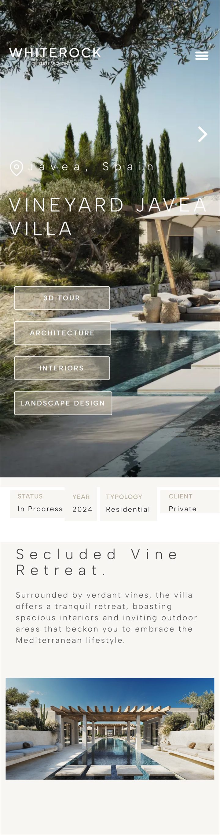
The first screen shows what the project is. It also shows the location, the disciplines, the status, and the client type before the longer story starts.

DesktopDesktop wireframe for a Whiterock project introduction
MobileMobile wireframe for a Whiterock project introduction
02 / Project depthDrawings and location stay with the project

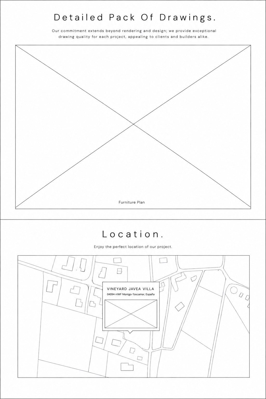
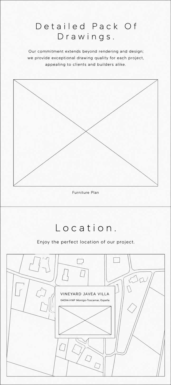
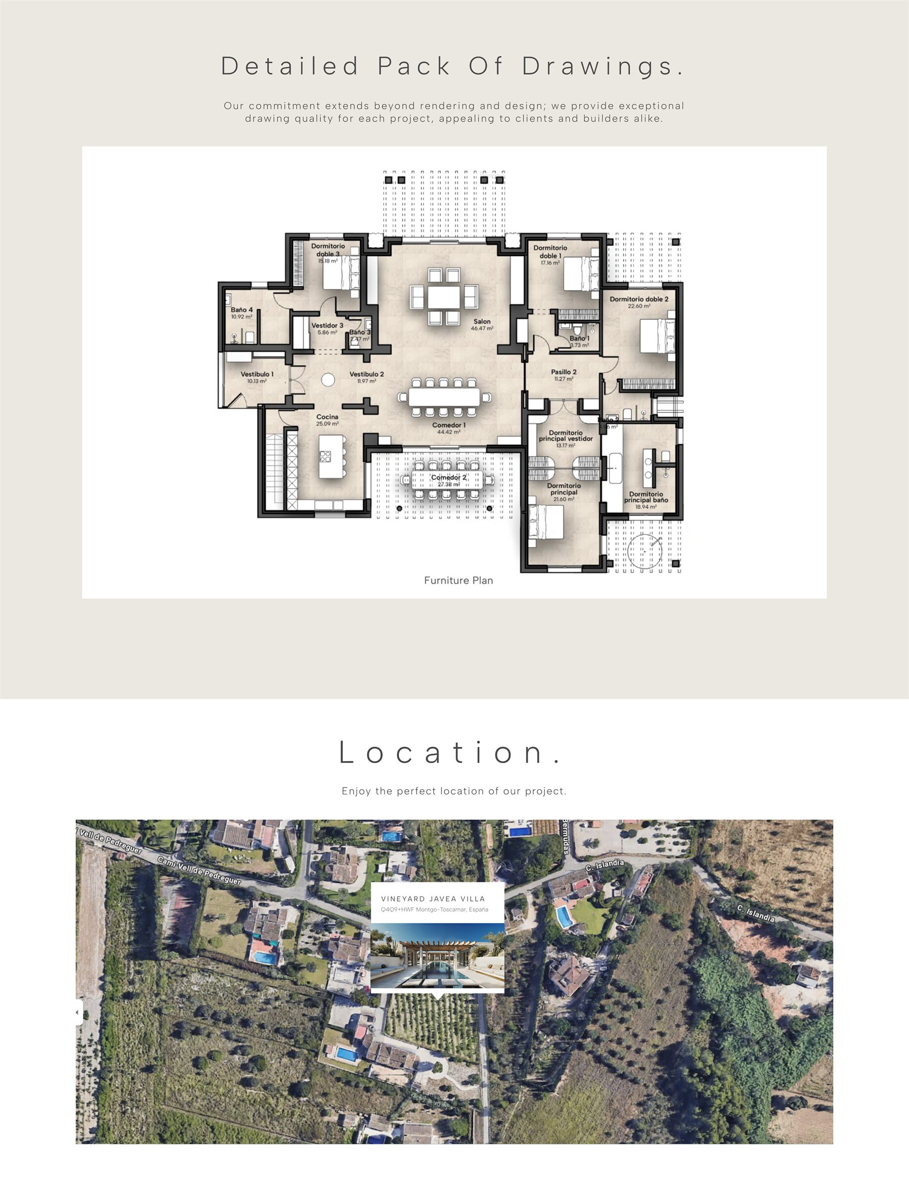
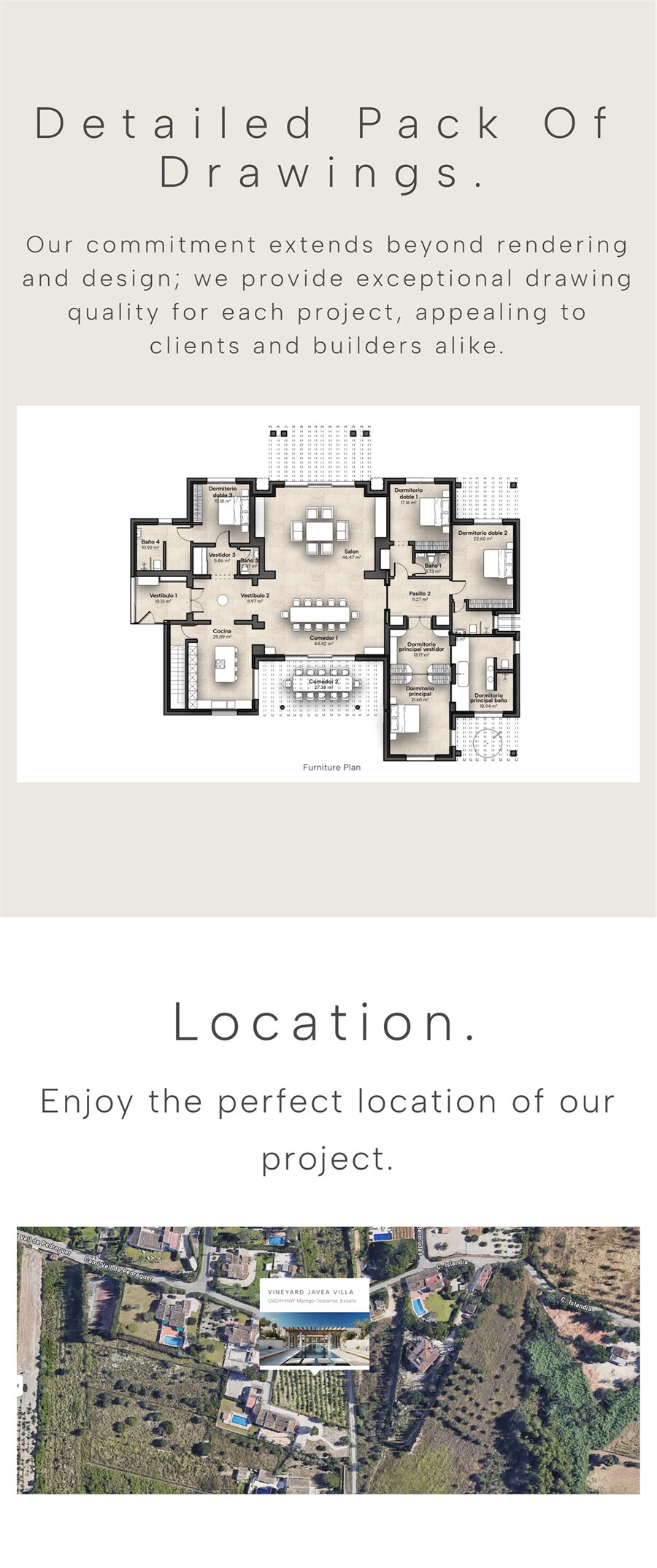
The drawings and the location stay inside the project page. They are not in a download or on a separate service page. A client can see the technical work next to the finished look.

DesktopDesktop wireframe for Whiterock drawings and location sections
MobileMobile wireframe for Whiterock drawings and location sections
( Key decisions )

Three decisions

Architecture portfolios have to balance three things. Images against information. Style against being easy to understand. Inspiring the visitor against asking them to act.

01

Start with mood, then give details

Observed

Many studio sites stay at the mood stage too long. Visitors get a feeling, but nothing they can use to judge whether the studio fits them.

Decision

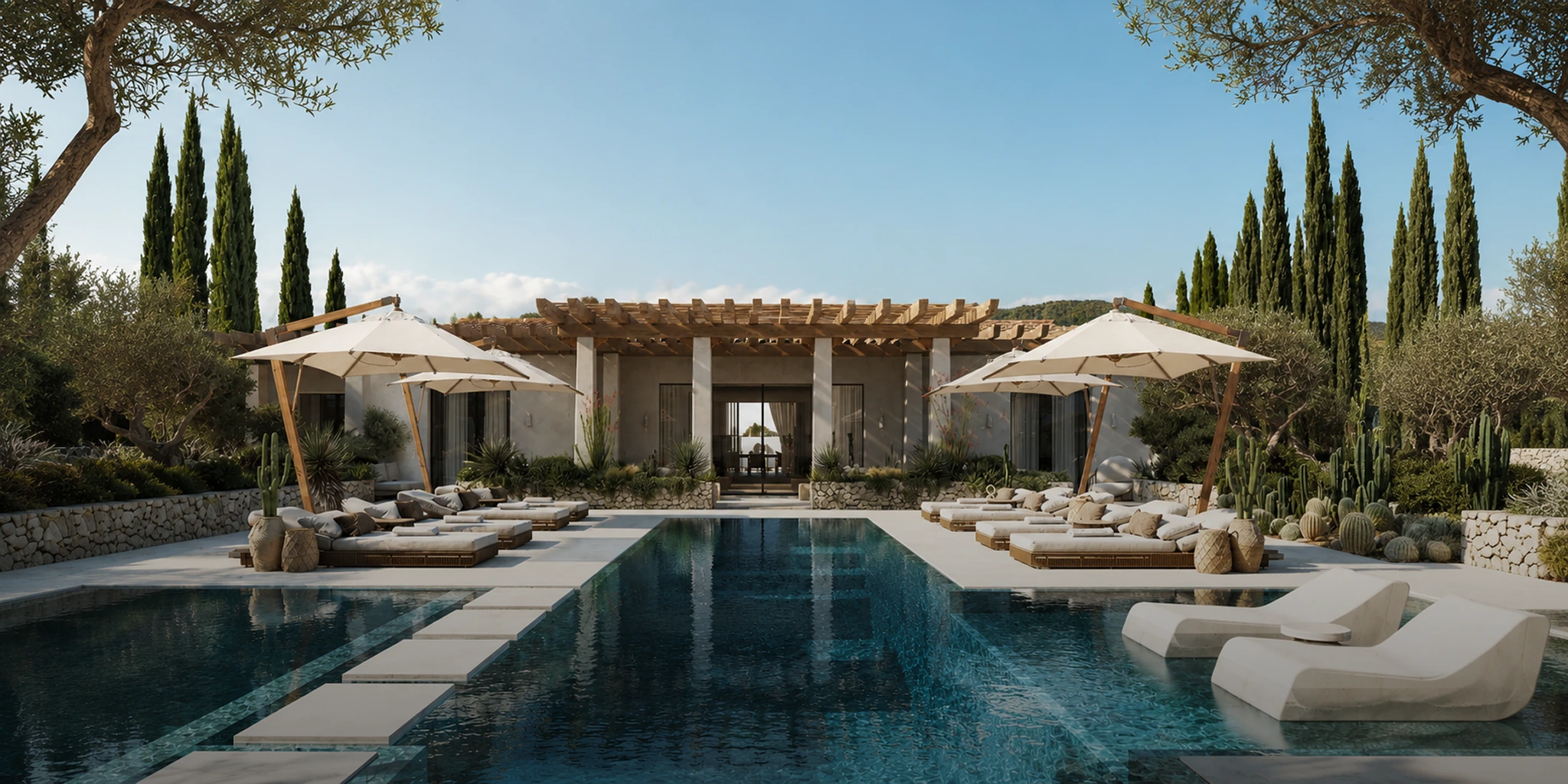
The hero image shows Whiterock’s Mediterranean style. After that come the design principles and the projects.

Trade-off

Big images look strong but make the page slower. So the images are cropped for each screen size and load in a controlled order.

02

Keep navigation visible and literal

Observed

Vague labels and drop-down service menus force visitors to learn the studio’s own words before they can see any work.

Decision

Use five visible links with no sub-menus: Design, Projects, About, Blog, and Contact. On mobile they sit in one menu.

Trade-off

A simple top menu means the detailed sorting has to happen on the project pages. That is a better place for it than a second site-wide menu.

03

Ask for the enquiry after the proof

Observed

A visible contact button helps. But repeating sales messages before people understand the work makes a studio look like it only wants the sale.

Decision

Contact stays in the menu the whole time. The full enquiry prompt only appears once the visitor has seen the projects and how the studio works.

Trade-off

The site has fewer buttons. So each one has to be easy to find, plainly named, and easy to use at every screen size.

( Responsive outcome )

What is on a project page

A project page has three parts: the project facts, the technical work, and what the studio thinks. Desktop and mobile show these parts in the same order. Only the layout changes to fit the screen.

01 / Project contextEnough information to decide whether to keep reading

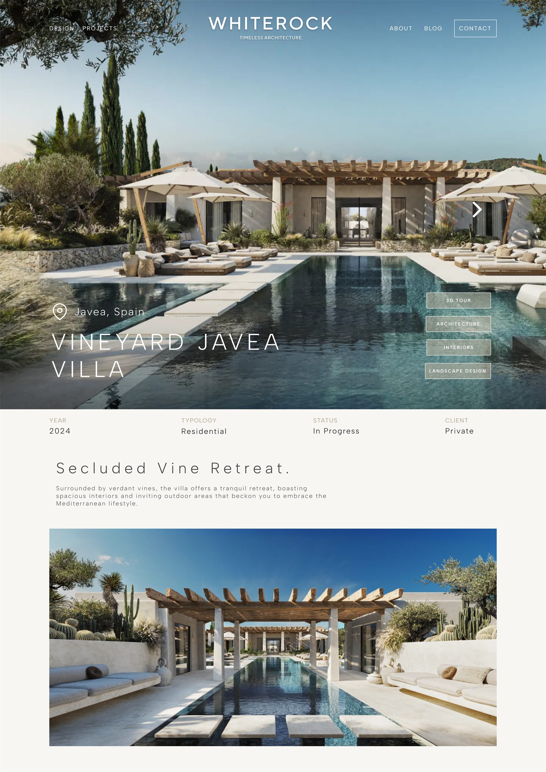
The project starts with the location, the disciplines, the status, and the client type. The large images come after that. Visitors can see if the project is relevant to them without opening a separate index or service list.

DesktopFinished Whiterock project introduction on desktop
MobileFinished Whiterock project introduction on mobile
  • 1Location, disciplines, status and client type sit above the image. Visitors can judge if the project is relevant before the photos take over.
  • 2Links to the disciplines — Architecture, Interiors, Landscape Design — sit on the project page. The range of the studio stays visible and no drop-down menu is needed.
  • 3A 3D tour of the villa opens from the project page. Visitors can walk through the space instead of only looking at photos.
02 / Technical proofThe portfolio shows more than finished renders

The drawings and the location stay inside the project page. Visitors can see the studio’s technical work without going to a separate capabilities page.

DesktopFinished Whiterock drawings and location sections on desktop
MobileFinished Whiterock drawings and location sections on mobile
  • 1The full furniture plan is on the page, not hidden in a download. The technical work stays visible.
  • 2A site map shows where the building is. The location stays part of the project instead of sitting on a separate capabilities page.
03 / Studio voiceShort texts explain the thinking behind the images

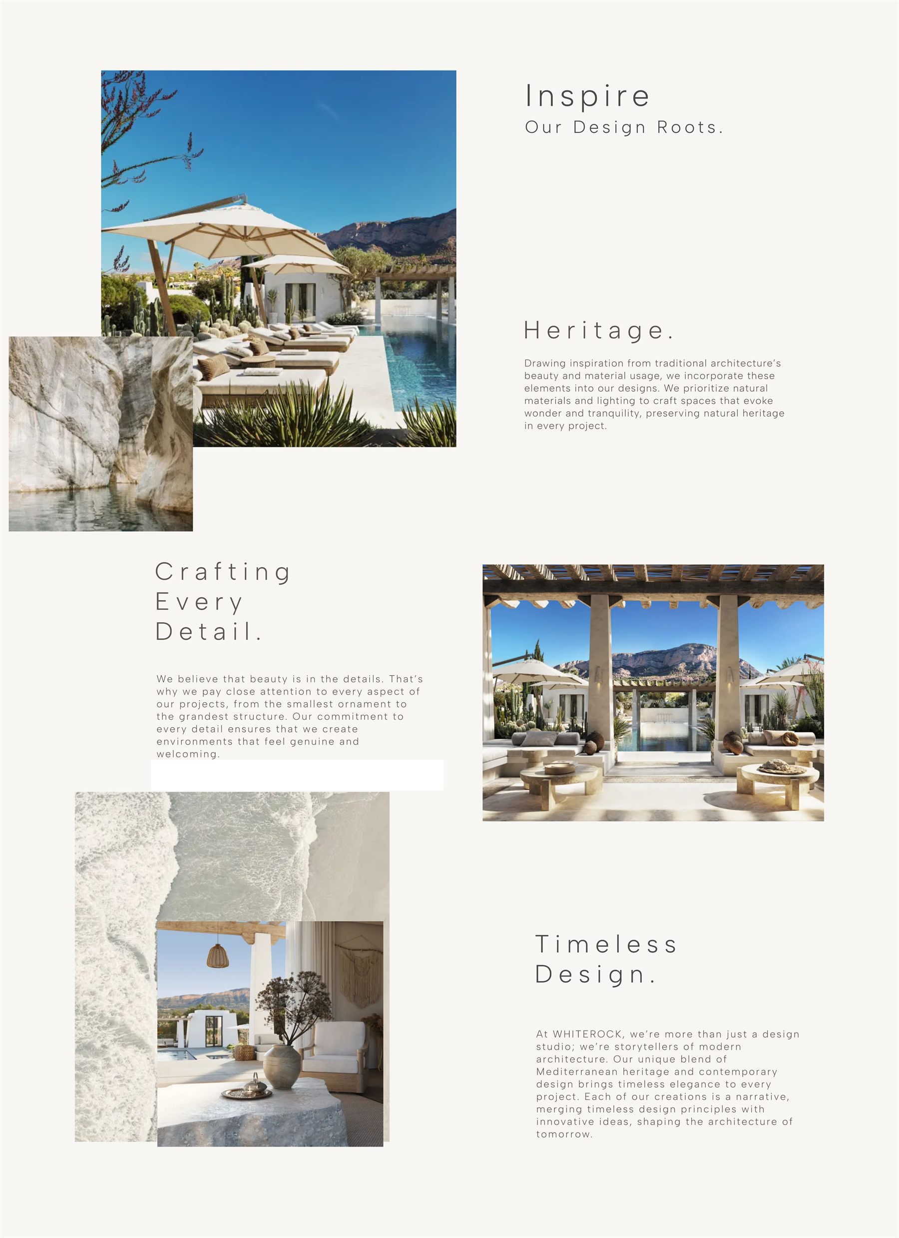
Short texts on heritage, detail, and long life show what the studio believes. They sit next to the work and stay short, so there is no long manifesto to read.

DesktopFinished Whiterock editorial sections on desktop
MobileFinished Whiterock editorial sections on mobile
  • 1Short texts show what the studio believes, without a long manifesto.
  • 2The images come first and the text supports them. The work stays the biggest thing on the page.
( Visual system )

Type and color

The system uses size and spacing instead of decoration. One geometric type family. Wide letter spacing on large headings. A small set of neutral colors. One muted-gold accent.

Typeface
Albert Sans

Regular is used for large headings and body text. Medium and semibold mark the smaller interface levels, so a second type family is not needed.

RegularMediumSemiboldBold
Material palette
Soft White#FAF9F7
Ivory#F3F1ED
Warm Stone#BDB3A0
Muted Gold#B19F6F
Charcoal#1A1A1A
( Design review )

What I checked

No external usability study was run. The numbers in the result come from the client or from Lighthouse. None of them come from analytics. I checked the finished build myself. I walked through three scenarios and ran an accessibility check on the interface.

01 / Relevance

Find work that fits

A visitor should reach a relevant project without opening sub-menus or learning the studio’s own words.

02 / Understanding

Explain how the studio works

The design principles and the project facts should show what the studio cares about before the visitor reaches the enquiry form.

03 / Contact

Start a conversation

Contact stays in the menu on every page. The full enquiry prompt comes later, after the visitor has seen enough to know what they are asking about.

Interface checks

WCAG AA contrast targets

Logical keyboard order and visible focus

44 × 44 px minimum mobile actions

Semantic headings and labelled fields

Reduced-motion support for animations that are not needed

( Result )

What happened after launch

The new site puts the finished buildings first and makes it easy to ask about them. In its post-launch feedback, the studio reported more qualified enquiries, including several that mentioned the new site by name. The studio also said the site looks more professional and is easier to use than the old one. These are client-reported outcomes, not analytics.

Measured on the live build · Lighthouse, desktop
92/100Accessibility
96/100Best practices
~0CLSNear-zero layout shift
2.3sDesktop load (LCP)

Mobile is the weak point. On a slow connection the same build takes 10.1s to draw its largest element. That is because every page starts with a large photo. It is the first thing I would fix next.

“The new website finally reflects who we are as a studio. Clients are spending more time exploring our projects, and we’ve already received several enquiries that specifically mentioned finding us through the new site.”

Gabriel E., Founder · Whiterock