Discovery & UX structure
- Client goals, and a check of the supplied content
- A short competitor review and buyer interviews
- Site structure and buyer journeys
- Simple wireframes and navigation
Research summary, sitemap, user flows, and wireframes
A three-week website design and build. It lets overseas buyers compare villas, look at floor plans, and send an enquiry without waiting for a sales call.
Sunti Residence needed a website that introduces the development, explains the villas, and helps the sales team. It also had to feel like more than a standard property brochure.
The brand was already set before I started: the client supplied the logo, typefaces and color references, along with the approved property information, imagery, floor plans and the finished 3D-tour assets. My work was everything from the structure down — the research synthesis, wireframes, responsive UX/UI, component system, tour integration and the front-end build.
Use large images, but keep the property pages fast to load.
Show prices and availability without making the site feel like a sales counter.
Build a flexible structure, because the property information was still changing during the project.
Add the 3D team’s tour to the responsive layouts, but do not make it the only way to see the villas.
Help international buyers with simple English content and clear enquiry paths.
The brand, the approved property content, the floor plans, the imagery, and the 3D tour already existed. So I spent the three weeks on buyer journeys, responsive interface design, integration, and the build.
Research summary, sitemap, user flows, and wireframes
Responsive screens, component system, and interactive prototype
Completed build, QA notes, design assets, and handoff documentation
Research summary, site structure, user flows, simple wireframes, responsive UI, reusable components, interactive prototype, front-end build, and build notes.
I reviewed eleven Phuket property websites. I also ran five remote interviews of 30-40 minutes each. The people I spoke to had recently shortlisted a home abroad, or they advised buyers who were doing that.
I found them through client referrals and professional contacts, then sorted my notes by the questions that kept coming up and grouped them by the stage a buyer had reached. The profiles below are composites built from those repeated patterns, not real individuals.
People who had recently shortlisted a property abroad, and people who advise international buyers
Client referrals and professional contacts
Five remote interviews, 30-40 minutes each
Notes grouped by repeated questions and by decision stage
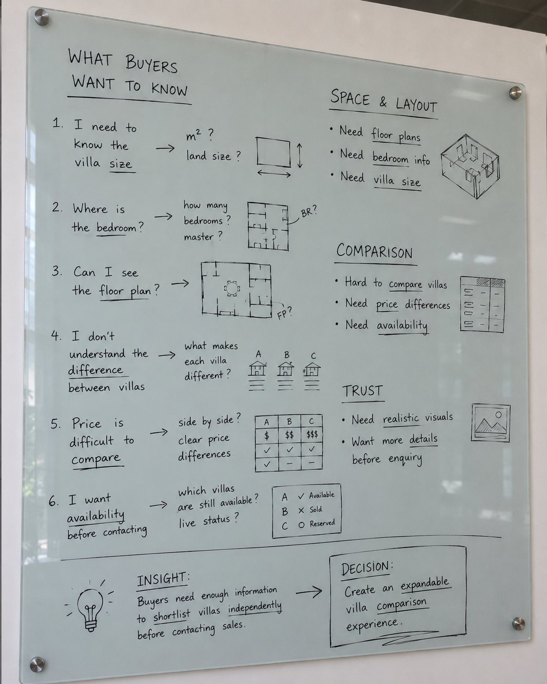
Every question I heard went on the board. Six kept coming back: how big is the villa, where are the bedrooms, can I see the floor plan, what makes one villa different from another, how do the prices compare, and which villas are still available.
Grouped, they were really three things. Space and layout: floor plans, bedroom counts, villa size. Comparison: villas are hard to compare, prices and availability are unclear. Trust: realistic visuals, and more detail before anyone gets in touch.
The six questions collapse into one: buyers need enough information to shortlist villas on their own, before contacting sales. The decision written beside it — “create an expandable villa comparison experience” — is the villa list further down this page.
To compare several villas from home, and see how they differ, before booking any sales calls.
Choosing a family home from another country. Needs to picture daily life there, and to see how the villas differ.
To check the price, what is still available, the build stage, and the location, before deciding to contact anyone.
Compares several developments on a desktop. Uses hard project facts to decide which sales teams are worth a call.
Before I styled anything, I built the site around the four things a buyer actually does: understand the development, compare the villas, check the plans and specifications, then enquire. I drew simple wireframes to set the order of the page, and to work out how the same information would fit on a phone.
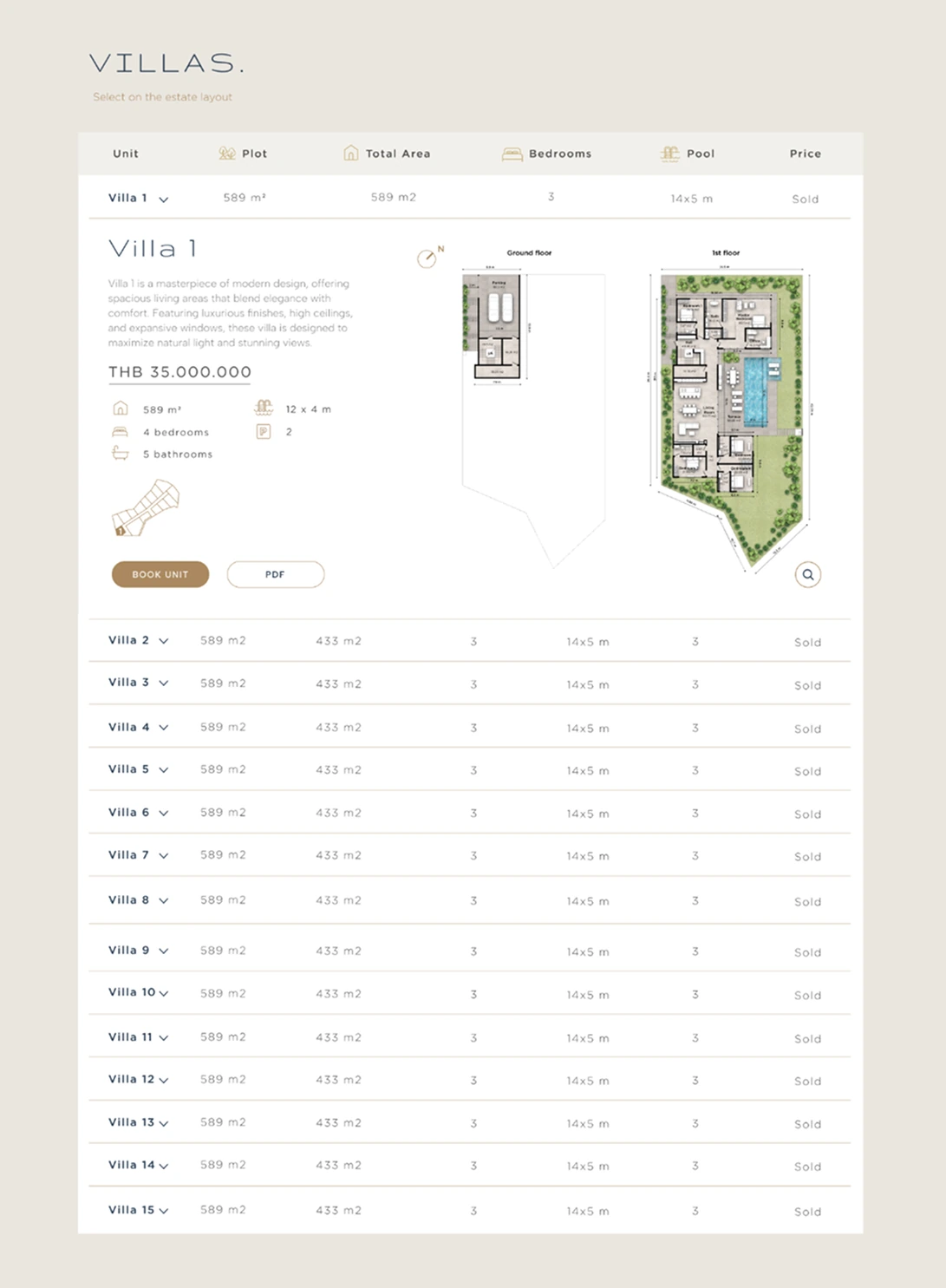
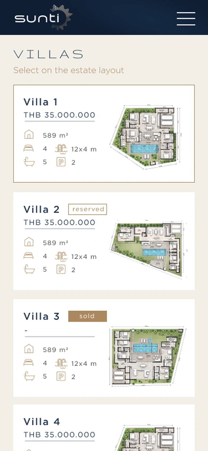
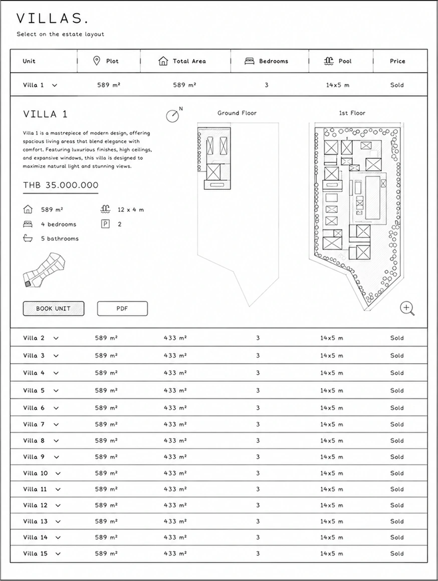
Every villa is a row: unit, plot, total area, bedrooms, pool, price. Open one and it expands where it sits, showing the description, the price, the specifications, both floor plans, the plot, and the two things a buyer can do next — book the unit or download the PDF.
The rows above and below do not move. A buyer can look at one villa in full without losing the list they were comparing it against. This is the screen the research pointed at, and it is why I chose one list over a separate page per villa.
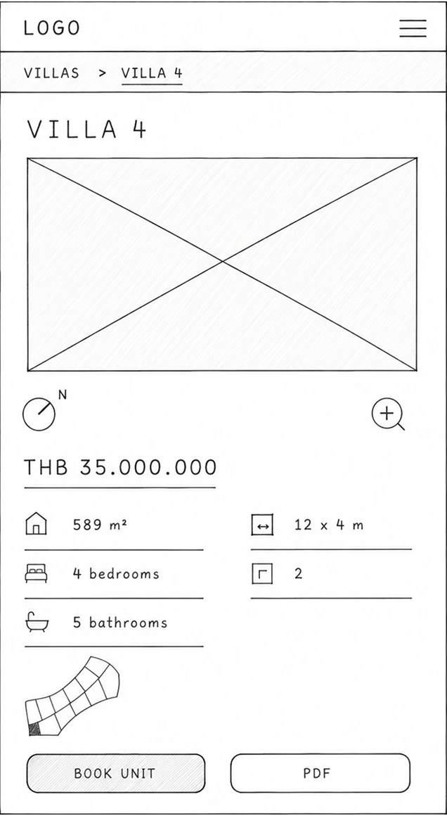
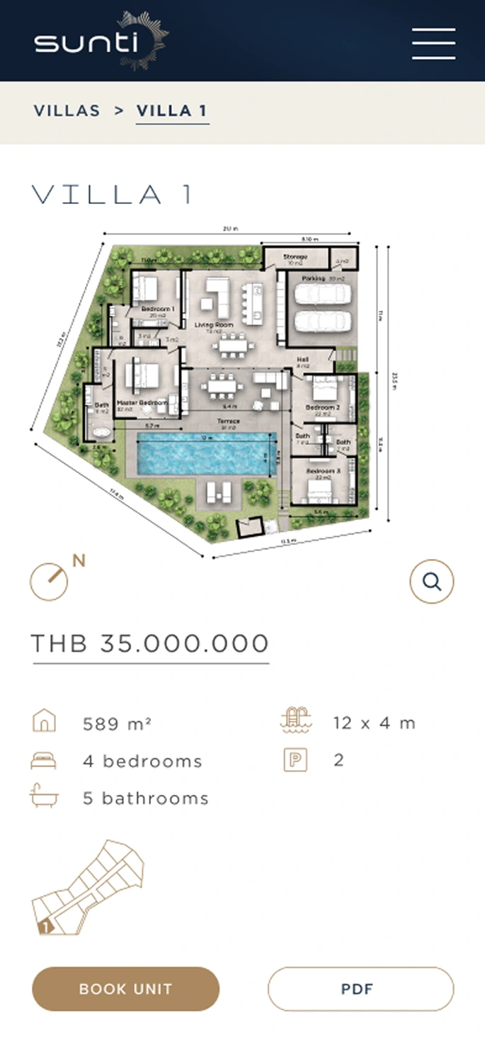
The phone gets the same decision with less room. Breadcrumb back to the list, the villa name, the price, the specifications a buyer compares on, and the same two actions.
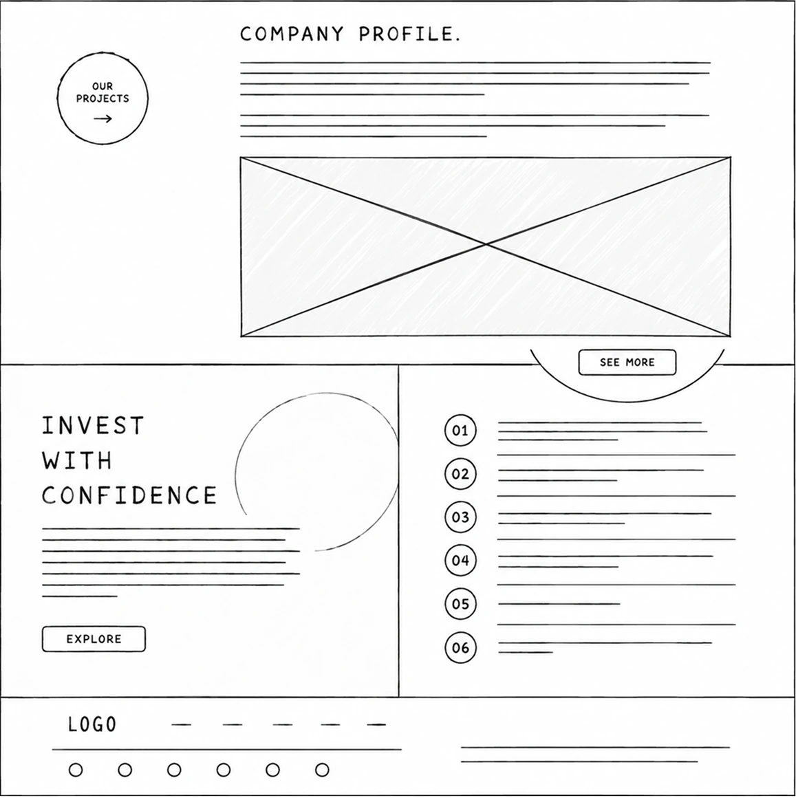
The wireframes tested the order of the page, not the styling. The screen below is one example. The company information stays ahead of the villa list. The final design then adds the look of the residence.
Start with the developer and the company. Then ask visitors to look at single villas.
The finished page keeps the same order. Large images, the type, and a few simple buttons then give the residence its own look.
Each choice connects a research observation to an interface change. The notes describe the design rationale and trade-offs, not post-launch results.
In my review of other property sites, most opened with sales language or long specification lists. Buyers had little help to judge the offer.
Start with the location, the architecture, and daily life there. Show the villa list and the prices after that.
The homepage shows the place first. Villa availability, plans, and practical details are one step away.
The investor profile comes for the price, and this order makes them wait for it. They want availability and price early, and instead they scroll past a story they did not ask for. I accepted this on one condition: the villa list stays one step away and is never hidden.
Every interview came back to the same question. How do these villas differ?
I looked at two options: a separate page for each villa, or one villa list with filters. I chose the list, because it keeps the comparison in one place.
On desktop, price, area, bedrooms, plans, and availability sit side by side. On mobile, they become villa facts and buttons.
No villa has its own page. Each villa gets less room to stand out. And there is no single link to send to a buyer who wants only one house. I chose comparison over presentation.
The specialist 3D team designed and produced the guided tour. I did not make it. I only presented it and added it to the website.
Use the tour as one way in, and keep the key villa information on the normal responsive pages.
The tour links into the villa-selection journey. But plans, specifications, availability, and the enquiry form all work without it.
Because every fact also sits outside the tour, the tour is optional. That makes the 3D team’s best work easy to skip. Some visitors will decide without ever opening it.
I reviewed the responsive prototype against two research profiles and three important tasks, then had the client check the content, prices, availability, and enquiry requirements. This was a design review, not evidence of post-launch behaviour.
See how the available villas differ, before calling sales.
The desktop table held too much. It did not fit on a narrow screen.
On mobile, the table became villa cards that are easy to scan. Each card opens one detail view.
Check the price, the plans, the specifications, and the availability. Then decide whether to enquire.
The facts sat on several screens. That was more work for the buyer, and harder to compare.
I put the price, the plan, the specifications, the PDF, and the booking button together for each villa.
Judge a villa without opening the 3D tour.
When the tour was the main route, buyers who skipped it could not reach the property information.
The tour now has direct links to each villa. The normal pages still hold every fact a buyer needs.
I checked the interface and the build myself. This was not an outside accessibility audit. Here is what I checked.
I checked the text and the controls against WCAG AA: 4.5:1 for body text, and 3:1 for large text and interface parts.
The navigation, the villa controls, the PDFs, and the enquiry buttons follow a sensible tab order. Focus is visible. No information appears on hover only.
Main mobile buttons are at least 44 × 44 px. They have enough space around them, so you do not tap the wrong one.
Page landmarks, heading order, form labels, and villa statuses all make sense without color.
Extra animation turns off if the visitor asks for less motion. Every property fact is available without opening the 3D tour.
These are goals to measure at launch. They are not results I am claiming.
Visits that reach Availability and then open at least one villa.
Enquiry forms that are started and then sent.
Mobile villa-detail visits where someone taps a contact button.
Largest Contentful Paint on an average mobile connection.
Compare the enquiry rate after a tour start with the rate from normal villa browsing. No key information sits only in the tour.
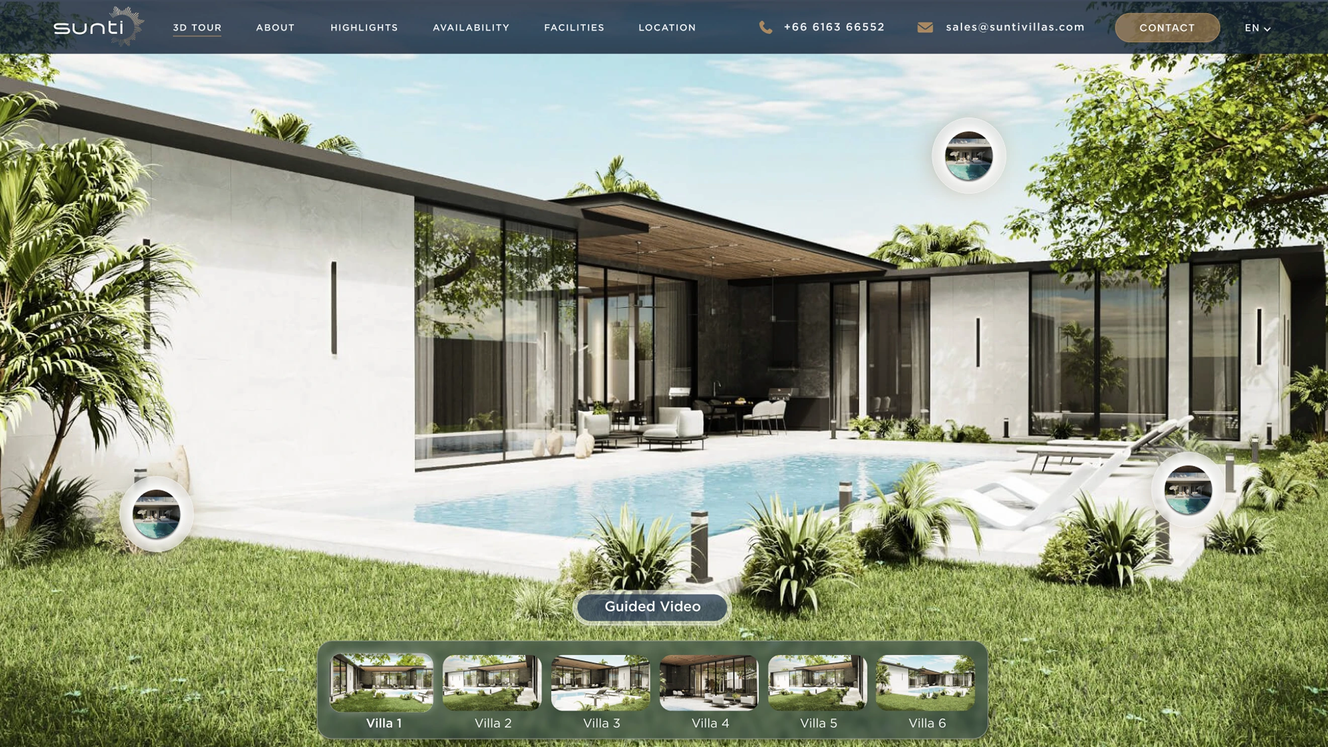
The final site starts with the tour, then moves to the villa comparison and the villa details. The tour stays optional. A buyer can do everything on the normal responsive pages.
The specialist 3D team created the tour. I added it to the site, so a visitor sees the residence first. Villa shortcuts stay on screen, so the next step is always clear.
Price, plot size, bedrooms, pool size, availability, and plans sit together in one view that opens up.
The desktop villa list becomes cards that are easy to scan. Each card opens a detail view with the plan, the specifications, the PDF, and the enquiry buttons.
I used Gruppo only for the big headings and the brand. I used Gotham Pro for the navigation, the property details, the prices, and the buttons. Navy and shell cover most of the interface. Brass is used rarely, only to draw attention.
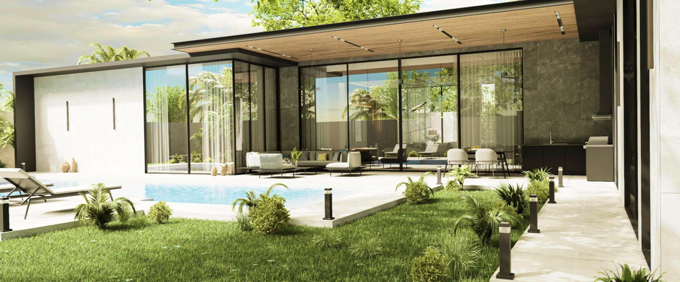
The finished website goes from an overview of the development, to the villa comparison, the villa details, the location, and the enquiry form. Large images show the place. Prices, specifications, plans, availability, and contact buttons are easy to find. The guided tour, made by the specialist 3D team, is one part of that route. It does not replace the main information.
The client reported that the new website became a key marketing touchpoint, attracting interest and supporting the sales process.
ClientThe redesign elevated the Sunti Villas brand, better reflected the premium development, and gave prospective buyers a stronger first impression through a simpler buying journey.